Tag: Visualization
-
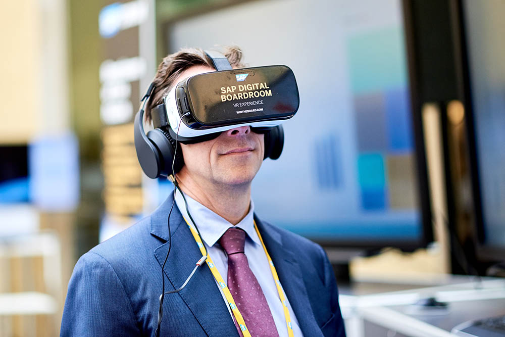
Concrete Steps Towards Virtual And Augmented Reality In The Enterprise
Virtual and Augmented Reality have long inspired the imaginations of futurists. Take, for example, this glimpse of a potential “Domestic Robocop” HyperReality future created by designer and film-maker Keiichi Matsuda in 2010. Every real-world surface in the short movie was covered with constantly-changing information — with lots of ads and the occasional glitch thrown in. Six years later, Matsuda…
-
The Joy (Division) of Visualization
Joy Division’s Unknown Pleasures album turns out to be a classic example of data visualization
-
SAP Lumira at SAP TechEd: Come See The Light!
Come see the light: visit the SAP Lumira booth at SAP TechEd.
-
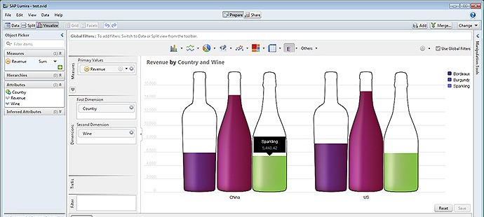
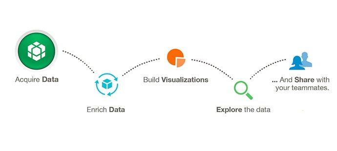
How To Use And Adapt SAP Lumira Visualization Extensions
First steps towards installing, using, and adapting the SAP Lumira Visualization Extensions
-

Data Visualization? Bling It On!
A timely post on the surge of interest in data visualization “bling”.
-
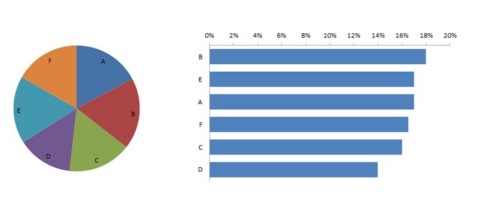
Brain Scans Show No Difference in Pie Chart and Bar Chart Perception?
Which is better for communicating information: pie charts or bar charts? Tufts researchers throw doubt on a common data visualization belief.
-
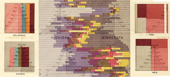
Stunning Business Intelligence Visualizations… from 1870
As any reader of Edward Tufte knows, data visualization has been around a long time. Here’s some nice examples from the 1870 US census.
-

BI in Bahrain
here was lots of interest in the SAP BusinessObjects portfolio of solutions at the SUG-MENA event in Bahrain. See the Xcelsius dashboard using local data, and the presentation I gave.
-
Alternative Dashboards?
Even earlier — and sillier — alternative Xcelsius dashboards.
-
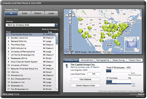
Where Was the Best Place to Work in the US in 2008?
The results of ComputerWorld’s 2008 best places to work survey, shown in an interactive dashboard using Xcelsius