[This is a follow on to the More Analytics Cartoon page]
Please feel free to use these cartoons in your presentations, university courses, books etc, for free, as long as you drop me a line to let me know what you have planned (telliott at timoelliott dot com),
Top cartoon page here, including links to analytics cartoons, more analytics cartoons, yet more analytics cartoons and artificial intelligence cartoons, marketing cartoons, social cartoons, innovation cartoons, sustainability cartoons, work frustration cartoons, other cartoons.
Note that I am not a gifted artist! While I drew the simpler drawings myself, the more impressive art is the work of ChatGPT, typically with a lot of combining and corrections in Photoshop to get the image I want.
A classic situation — lots of analytics, but still no information:

No, I’m afraid we can’t just make it up — this is business, not politics!

Facts can be annoying to some managers…

It’s really important to have a clear data strategy:

It’s clear that we need more data…

Virtual reality analytics? Sure. But how do I get it into Excel?

More whimsy is needed in digital dashboards!

We’re pretty sure about the data quality in this box…

A sobering thought!

Finally, a data visualization you can get your teeth into!

It’s important to try new ways to get the data across to people….

Excel is really not the best tool for complex analytics…

SO many organizations still rely on spreadsheets for things like complex planning, when they really shouldn’t (there are now much better alternatives)

Data is like children. It’s constantly on the move and loves to get dirty 🙂

How was I supposed to clean the data, then?!

This is not what people mean by a data dump…

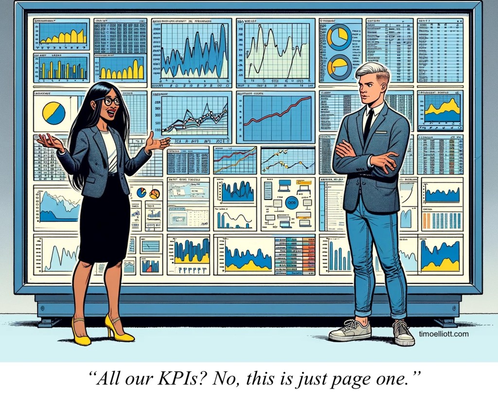
An increasing number of “Key” Performance Indicators is not a sign of progress!

In an ever-changing market environment, maybe you do need a crystal ball!

When did your data last enjoy itself?!

A very niche Belgian data lake joke (this is the Mannekin Pis statue in the center of Brussels).

Here’s a rare sighting of a data miner in action!

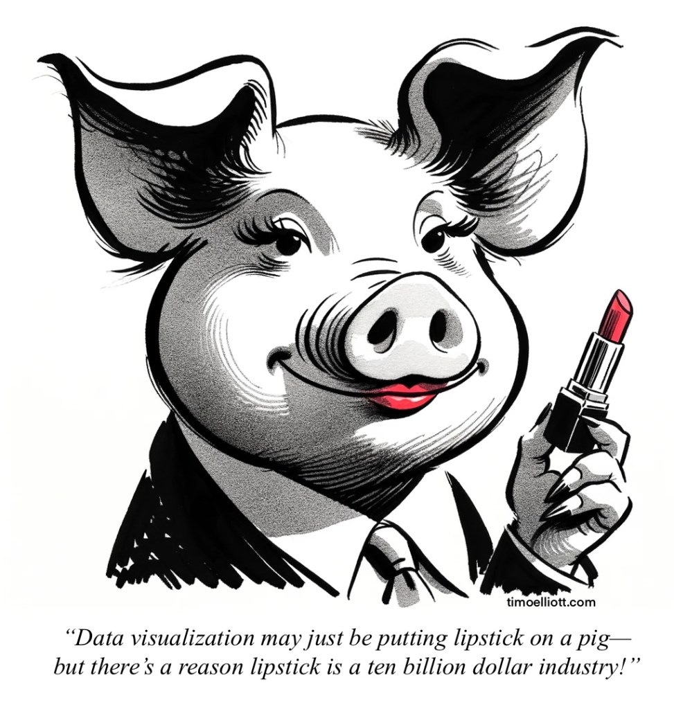
Data visualization doesn’t work if the underlying data isn’t good (and that’s usually the case) — so it can be “lipstick on a pig”. And yet…

I hate the analogy of “data is the new oil” (dirty, polluting, unsustainable), and prefer “data is the new soil”. Here’s a… variation on that: what if data were… shit?

Using facts and data for analytics can be really tedious when there are other ways of doing things…

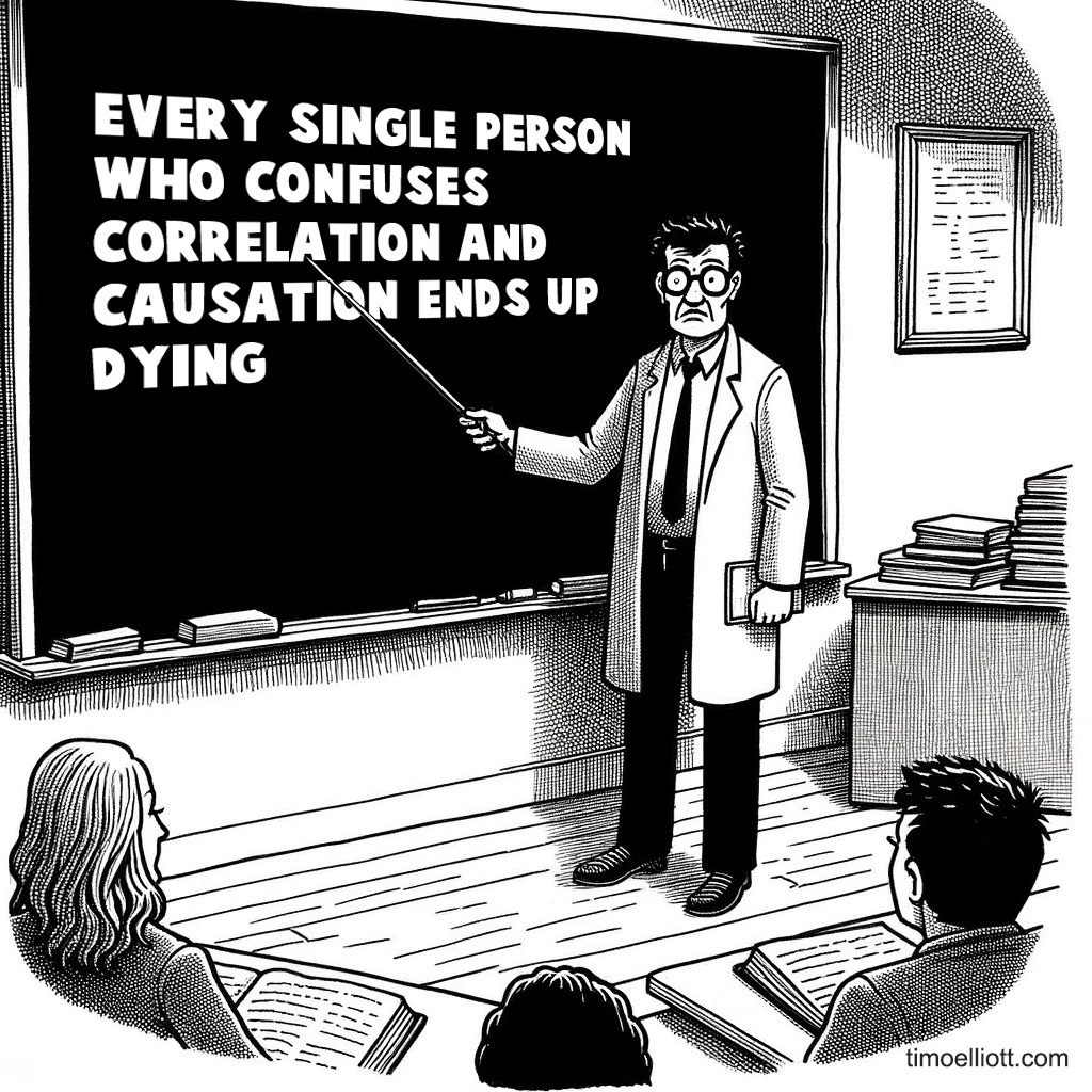
And even if not knowing about survivor bias never did you any harm, that doesn’t mean it’s not real!

Data quality? Too hard to fix, probably… so let’s go ahead anyway!

