We’re clearly entering a new era in government transparency, and we can hope that allowing citizens to access information interactively through business intelligence functionality to spot inefficiencies and opportunities will be a big part of transforming the way the public sector works.
In my previous post, I talked about how the American Recovery and Reinvestment act is perhaps the largest, most complex business intelligence application ever. And since the US has now appointed its first ever “Chief Performance Officer”, Nancy Killefer, who will work with economic officials to increase efficiencies and eliminate waste in government spending, it seemed like a great time to talk about other great examples of US government transparency and business intelligence.
Open Government
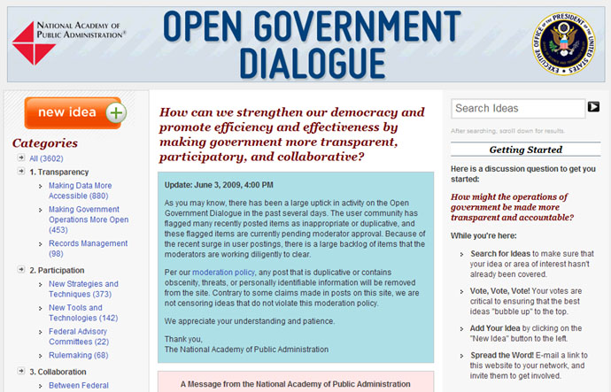
The Recovery Act is only one tiny part of government transparency. Dan Everett Jr. of SAP has written a great blog post about the subject and points out that in May the National Academy of Public Administration started soliciting input from the public on how to make the government more transparent at http://opengov.ideascale.com/ (sadly, there’s no moderator on the site, and the nutters have taken over: check out the dialog around making data more accessible).

Another Obama administration initiative, the http://data.gov web site is starting to providing lots of other US government data to anybody who wants to analyze it:
“The purpose of Data.gov is to increase public access to high value, machine readable datasets generated by the Executive Branch of the Federal Government. Although the initial launch of Data.gov provides a limited portion of the rich variety of Federal datasets presently available, we invite you to actively participate in shaping the future of Data.gov by suggesting additional datasets and site enhancements to provide seamless access and use of your Federal data. Visit today with us, but come back often. With your help, Data.gov will continue to grow and change in the weeks, months, and years ahead.”

There’s a content for applications that can best make use of this data at http://sunlightlabs.com/contests/appsforamerica2/

There doesn’t seem to be much uptake so far – maybe because the first submitted application seems a little trivial – it lets you play a memory game with photos of FBI Fugitives culled from the FBI’s feeds of fugitives (but it doesn’t even tell you who they are!)

Federal and Regional BI Examples
In an article on how ARRA Will be a Boon for Business Intelligence, Dr. Ramon Barquin reports how education provisions are also driving business intelligence, and gives some examples of mandated metrics as communicated by the Department of Education last month:
- Number and percent of teachers and principals rated at each performance level in each local education association’s (LEA) teacher evaluation system
- Number and percent of LEA teacher and principal evaluation systems that require evidence of student achievement outcomes
- Most recent math and reading National Assessment of Educational Progress (NAEP) scores
- Percent of ELLs and students with disabilities tested in math and English language arts (ELA)
- Number and percent of students who graduate and complete one year of college
- Number of schools in restructuring status that demonstrated substantial gains in achievement, closed or consolidated – last 3 years
- Number of schools in the bottom 5% of those schools that demonstrated substantial gains in student achievement, closed or consolidated – last 3 years
- Number and percent of schools in restructuring status that have made progress in math and ELA in last year
- Charter school caps, number operating, number closed
The Federal Election Commission provides information about campaign financing

The State of Washington Transportation Improvement Board, an independent state agency that makes and manages street construction and maintenance grants throughout Washington State, uses Xcelsius dashboards to manage the agency’s $200 million of revenues generated from state gas taxes. In a nice example of transparency, they provide the public with the same view as the agency’s Executive Director.

Some of the benefits the agency has realized include
- Reduced delayed projects by 70%, saving millions in public funds
- Reduced accidents by 19% and injuries by 30%
- Reduced average payment cycle from 5 months to 17 days
New York City has a huge range of different statistics available, e.g. my neighborhood statistics:
NYCStat is New York City’s one-stop-shop for all essential data, reports, and statistics related to City services. Available at www.nyc.gov, NYCStat provides access to a wide array of performance-related information including citywide and agency-specific information, 311-related data, and interactive mapping features for selected performance data and quality-of-life indicators.
![image16[1]](https://i0.wp.com/timoelliott.com/blog/wp-content/uploads/2009/07/image161.jpg?resize=690%2C379&ssl=1 "image16[1]")
The State of Washington has a public “Government Management Accountability & Performance” site that provides easy access to dashboards of key performance indicators in areas such as economic vitality, government efficiency, health care, public safety, transportation, etc.


The State of Maryland has “StateStat” that provides dozens of key performance indicators from different state agencies (agriculture, environment, general services, state police, transportation, etc.)

The City of Henderson in Nevada uses SAP’s Strategy Management software to track the strategic planning process, and then provides that information to residents:

Other countries are getting in on the act, too. For example, the British Prime Minister has announced that Sir Tim Berners-Lee, the inventor of the web and an eager proponent of better access to government data, will be helping the government make more of its data available online
Think-Tanks and Watchdogs
The Pew Center on the States web site has followed state government performance for more than a decade, studying good and bad practices and analyzing what works. Their conclusion is that results-based budgeting systems works: states cut wasteful spending on programs that are not showing results, and instead direct the resources to more effective :
”The unfortunate truth is that most states today do not have the tools in place to make well-informed programmatic and budget decisions. There is no way to know how much money states lose to mismanaged or underperforming programs. But those states that have begun to make policy decisions based on data
measuring the performance of government, a process called “performance-driven budgeting,” have saved impressive amounts of money—some in very short periods of time. The choices they have made have not been easier, but they have been smarter.”

The excellent Grading the States web site puts the Pew data into dashboard format, making it easy to compare states’ performance.

Here are some interactive models from the site, using Xcelsius dashboards — give them a try!
[kml_flashembed fversion=”8.0.0″ movie=”http://www.gradingthestates.com/benchmarker.swf” targetclass=”flashmovie” publishmethod=”static” width=”690″ height=”500″]

[/kml_flashembed]
[kml_flashembed fversion=”8.0.0″ movie=”http://www.gradingthestates.com/GPPMoney.swf” targetclass=”flashmovie” publishmethod=”static” width=”690″ height=”750″]
[/kml_flashembed]
[kml_flashembed fversion=”8.0.0″ movie=”http://www.gradingthestates.com/allgppgrades.swf” targetclass=”flashmovie” publishmethod=”static” width=”690″ height=”650″]
[/kml_flashembed]
Govtrack.us keeps track of representatives voting records

Maplight.org “illuminates the connection between money and politics” by bringing together the campaign contributions of legislators and their voting records. Check out their intro video for a great overview.

Third-Party Sites that Promote Government Transparency
The Swivel.com web site features data that furthers public debate and increases transparency, and lets people upload and share data from other sources (although the last uploads seem to have been a year ago?)

IBM’s ManyEyes site does something very similar

The New York Times has a homicide analytics map:
![image4[1]](https://i0.wp.com/timoelliott.com/blog/wp-content/uploads/2009/07/image41.jpg?resize=690%2C418&ssl=1 "image4[1]")
Optimizing BI from Governments
The list above obviously only scratches the surface – there are many, many other US public sector bodies that are publishing information online.
The scattering of different projects across the different agencies and bodies is similar to the silos of BI projects inside large organizations, with many of the same problems.
There are three in particular that will need to be addressed:
Not enough goals. As Jos van Dongen pointed out to me on Twitter, the most glaring thing missing from most of these performance dashboards is concrete goals: numbers themselves are meaningless unless you have something to compare them to.
Not enough marketing. There’s not enough emphasis on “what you can do with this data”. It’s the classic business intelligence “build it and they will come issue”. Right now, the sites above all emphasize what data they have, but few of them have good examples of what you can actually do usefully with the data, or great examples of what others have done. Without this, government BI will face the same problem as many private projects: low usage and no grasp of any return on investment, leading to disinvestment over time.
Not enough standards. As you can tell from the bewildering variety of formats and statistics above, there’s clearly a lack of standards on what should be tracked, and how data can be compared between different states and agencies, and the choice of indicators changes over time.
This is exactly the same problems faced by organizations (right down to the choice of KPIs – a change of State Governor is much like a change of top executive – in both cases, they are likely to feel like they have to “change the agenda” and use different KPIs than their predecessor).
In companies, a BI competency center is the recommended approach, a body that explicitly has the authority to overview the different BI projects that are going on within the organization, and impose standards (tools, metadata, definitions, reporting formats…).
How will this be handled for the US Government? The fact that there are sites that now have the job of gathering information across the country, like recovery.gov and data.gov will help, and external organizations like the Pew Trust will help encourage areas. But these pressures alone will not be sufficient.
Ultimately, help will probably come primarily from organizations like the United Nations. As part of their work, they help organizations compare performance in various areas, such as education. They publish league tables of countries that encourage participation, and they have the mechanisms required to negotiate standards that everybody can agree on.
These standards are then increasingly used within countries as well — although, just like in organizations, some nations prefer their own, “better” or “more adapted” statistics (cynics might call this “leaving wriggle room to explain away bad numbers”).
Comments
3 responses to “Great Examples of US Government BI Transparency”
[…] wrote about this site and others in a post in July, Great Examples of US Government BI Transparency. Unfortunately, it turns out that it’s not so great, in that some of the data shown was […]
Another great example — http://it.usaspending.gov
[…] This post was Twitted by rhirsch […]