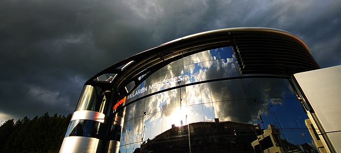
Last week I had the opportunity to attend VRAAAAAAAAAAAOOOMMMM a corporate event at the Belgian VRAAAAAAAAAAOOOOMMMMM Grand Prix, and present an SAP BusinessObjects product overview and roadmap.
 Unfortunately, the pleasure of having the opportunity to visit the famous Spa circuit, meeting Heikki Kovalainen, and seeing Lewis Hamilton at dinner was a little VRAAAAAAAOOOOOMMMMM drowned out by the constant, annoying VRAAAAAAAAAAAOOOOMMMM sound of race-cars VRAAAAAAAAAAAAAAOOOMMMMM whizzing by as I was trying to cover a detailed road-map at the end of a long day.
The presentation covered some BI trends and some demonstrations of some of the latest technology, including, of course, some Xcelsius dashboards and Explorer data exploration.
If you’d like more information about the detailed product roadmap, please get in touch with your local SAP contact, and if you have a problem, don’t hesitate to contact me directly.
One of the themes of the day was information overload – take a look at the Maclaren Vodafone Mercedes steering wheel below (there’s also a selection of levers for changing gears, etc. on the back) – and some teams have even integrated an information screen into the center of the wheel.

 The current Grand Prix rules state that the teams in the pit can monitor what’s happening on the car, but they are not allowed to make adjustments directly – everything has to be done by the driver (previous rules had allowed this, but it was starting to becoming a race between remote-controlled cars with ever-less driver involvement).
So while the driver is trying to beat the competition, he also has to be constantly tweaking the knobs and thumbwheels as dictated to him over the radio, making it a job that requires almost as much information processing power as driving skill. I’m sure it’s a situation that the average CEO, guided and limited by CFO recommendations, can related to.
One anecdote told to me by a Maclaren Vodafone Mercedes team member was about the earliest days of the new generation of steering wheels, and it has distinct echoes of the corporate world of analytic dashboards:
Nelson Piquet’s team showed him the new light that would indicate when his brakes were getting too hot.
“So what am I supposed to do when it lights up”?
“Well, we don’t know, but we thought it would be useful”.
When Piquet finished the first trials, in good position, his team asked for feedback — only to find that he’d simply stuck black tape over the light and ignored it: “I already have enough to concentrate on – I didn’t need anything else distracting me”…
Thanks again to the folks who came to join us for the day!


Comments
4 responses to “Grand Prix Business Intelligence”
Some ideas for improvement:
A) Showing multiple KPIs at the same time would really improve the usability of this dashboard.
B) The color scheme for the pie chart for engines is very hard to distingusih. A top 10 bar chart, sorted in desc order would be more helpful
Tim,
This is awesome!
Mico
Founder, Xcelsius Gurus
Hey Timo,
Cool post. The link to download your powerpoint doesn’t seem to be working – can you re-upload?
Thanks,
Sean
Sean, thanks — link now fixed.