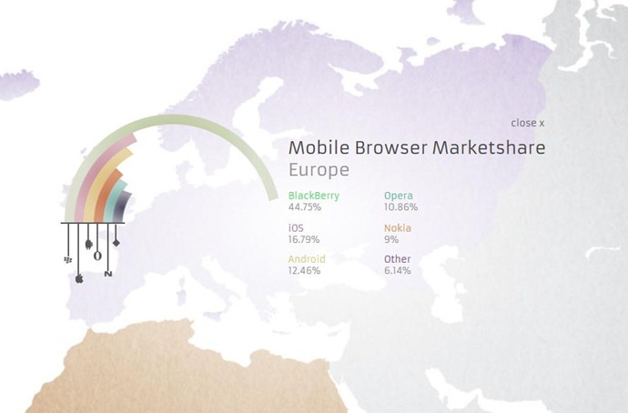
For April Fool’s Day I did a post on Data Visualization Bling. It included a mention of curved bar charts (a ridiculous idea), but I didn’t find any really good (i.e. bad) examples in time to include in the post. But Adobe has kindly helped me out, with this superb effort designed to show off the power of their HTML5 animation tools:


Comments
2 responses to “Curved Bar Charts. Sigh.”
Glad to see someone else sharing disdain for this kind of chart! A major music industry publication (that I will not name here) used several curved bar charts in an article just a few months ago, and it irritated me so much that it inspired me to write about it in my own blog (http://bit.ly/XXOTqx). Unfortunately, most people who publish data visualizations tend to prefer style over functionality (as evidenced by the number of poorly-designed infographics I see every day!), not realizing that their preference compromises a reader’s ability to fully understand the message the chart is intended to convey.
From time to time I like to write about bad charts/bad ideas and how to use them in Excel. Then I start getting requests that begin with “I know you are being sarcastic, but how do you make that chart in Excel?”.
Humans are hopeless.