Category: Visualization
-
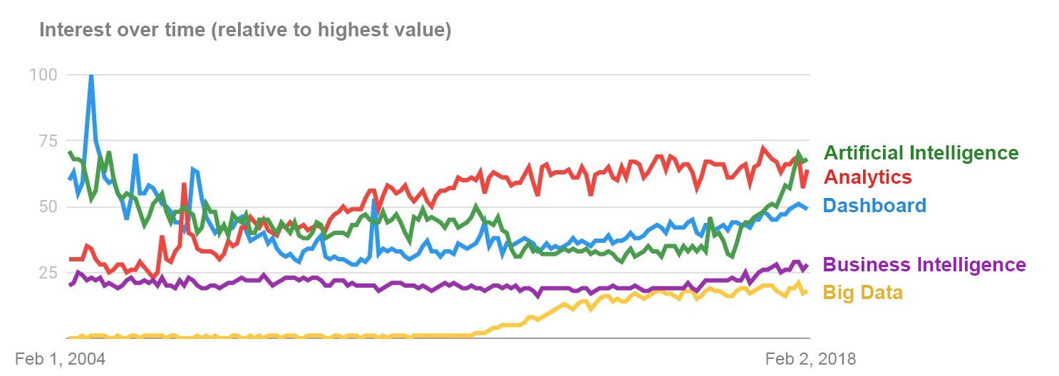
Is Big Data Dead? Are Dashboards Obsolete?
Which terms are hot and which are not in the world of analytics?
-
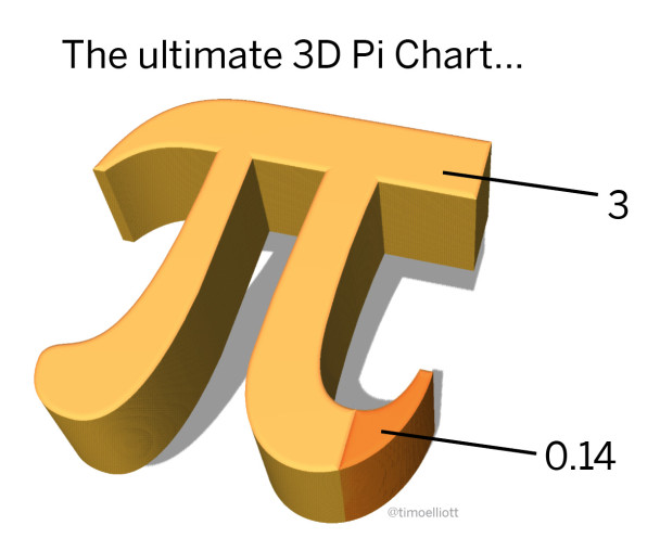
The Ultimate 3D Pi Chart
If you like 3D Pie charts, I hope you’ll enjoy this 3D Pi chart…
-
The Joy (Division) of Visualization
Joy Division’s Unknown Pleasures album turns out to be a classic example of data visualization
-
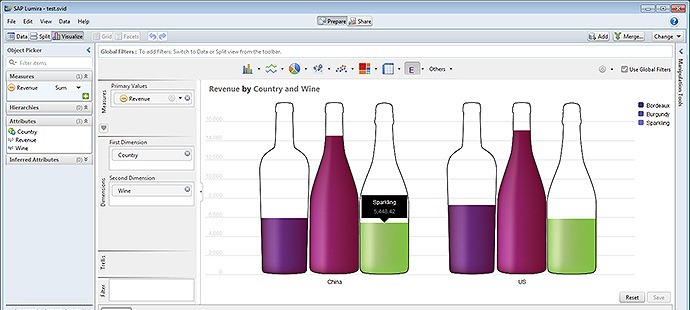
How To Use And Adapt SAP Lumira Visualization Extensions
First steps towards installing, using, and adapting the SAP Lumira Visualization Extensions
-
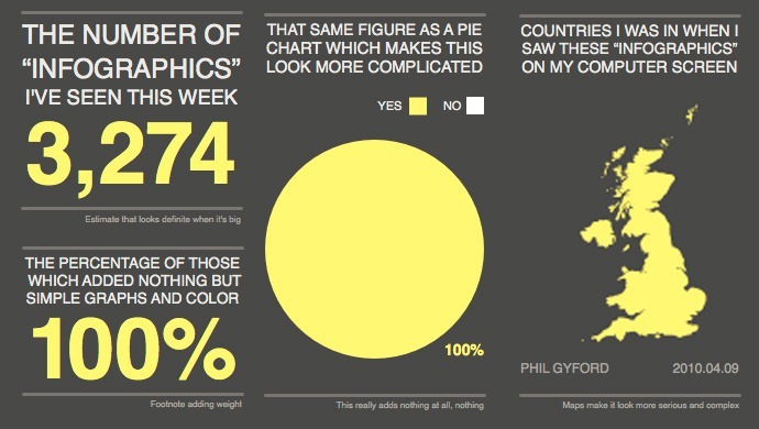
What Are Infauxgraphics?
Infauxgraphics are infographics that are ugly, silly, misguided, or misleading. Here are some links and examples.
-
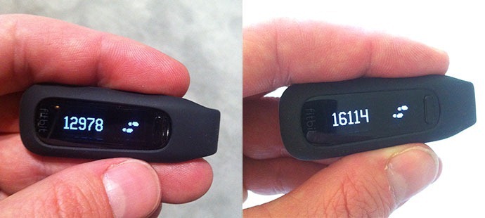
Results of the Fitness Challenge using SAP Lumira
During SAPPHIRE NOW in Orlando, the analytics team issued a “fitness challenge,” asking people to record their activity with a device such as a Fitbit or Jawbone Up — here are the results, using SAP Lumira
-
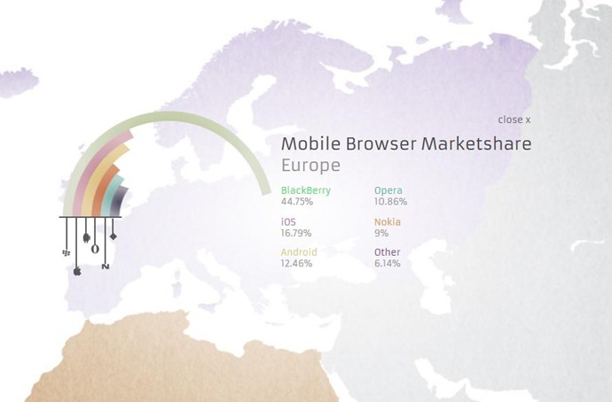
Curved Bar Charts. Sigh.
An example of curved bar charts from Adobe (don’t copy this!)
-

Data Visualization? Bling It On!
A timely post on the surge of interest in data visualization “bling”.
-
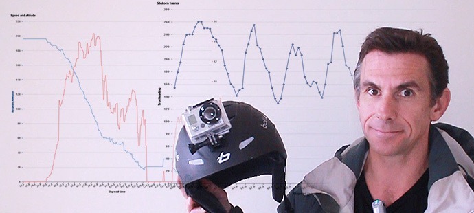
Ski Analytics With SAP Visual Intelligence
An example of ski analytics, using SAP Visual Intelligence, the “Sensor Data” iPhone app, and a helmet-mounted go-pro camera.
