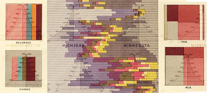
FastCompany has a great article this week on the results of the 1870 census, and the hand-made graphics (“BI –2.0”?) that were made from the data (thanks to RadicalCartography.net and the Library of Congress). [NOTE — the original version of this post erroneously said “1830” throughout]
Here’s a selection of my favorites – click on each one to get the full graphic.
US geology – the hand-shading is so much nicer to look at than computer-generated graphics:
Nationality data mapped:
There’s a lot of history illustrated in this fiscal chart:
- The light blue spike in the lower right is the US Civil War (1861-1865), which prompted the introduction of a “temporary” progressive income tax (the light pink blob in the lower left) that was originally supposed to expire in 1866!
- The pink blobs on the right are a record of expenditures on the US Indian wars
- The dark blue spike in the middle of the left-hand chart shows land sales in the West – which may have caused the collapse of the banking system in 1837
This is a beautiful rendering of church-going in the US. Interestingly, rather than show non-churchgoers as a separate bar, they are relegated to a grey box around the outside.
Here’s a nice example of showing data through proportions.
And here’s proof that men are bigger idiots than women! (of course, they meant what we’d call “mentally ill” these days)
Population charts showing that the “cowboy states” (e.g. Wyoming, Nevada, Montana) were populated by young male foreigners, while Utah had LOTS of children.
This chart is a good example of something that hasn’t changed much in the last couple of centuries – the notion that you should show data just because you have it. For example, Chart 1 below show deaths per month per state. Is this data actionable in any way?
Later charts aren’t nearly as attractive, like these, from the 2000 Census:

If you liked this post, you might also like:


Comments
15 responses to “Stunning Business Intelligence Visualizations… from 1870”
[…] For more of these stunning visuals and a power point deck jump over to this page on TimoElliot.com […]
[…] Here’s Some Links: 15 Examples to Start with – 1830s Business Intel – Stock Market Visualizations – Edward Tufte (& another site) – Thomas Briggs […]
[…] einige solcher Grafiken (siehe auch hier) aus Amerika aus dem Jahr […]
Hi Timo,
Great blog
The link to the ppt is not working
Can you check this
Thanks,
Richard
Thanks for the heads-up — now fixed.
[…] Stunning Business Intelligence Data Visualization Examples | BI Questions Blog […]
[…] een eigentijds fenomeen? Niet echt! Al in 1870 waren ze ermee bezig. Daar kunnen sommige dashboards nog wel een puntje aan […]
Would be nice to have a ‘retro’ pack to create visualisations like this.
I’d like to see those paper wrinkels in my charts. If it’s old, it’s probably true :^).
I agree! Maybe a nice “theme” add-in for Xcelsius? 🙂
[…] Vi segnalo questo eccezionale post sui report riguardanti diversi tipi di “public data” … […]
[…] March 18, 2010 better charts in BEx web Posted by Leander Hester under Uncategorized Leave a Comment When do we get charts like this: Business Intelligence in 1830 […]
Interesting stuff – shows that visualization of data is not anything new. I would take issue, however, with your statement regarding the notion that mortality information isn’t actionable? Lots of health service and infrastructure planning relies on this kind of information. Would indicate where I need to be sending doctors and medicine, building hospitals, etc. And almost every entity that tracks growth information, (sales, income, units), needs to net out costs/losses to really understand what’s going on.
John, I think you’re illustrating my point. In general, yes, mortality data is useful, of course. But just because data is useful in theory doesn’t mean that a specific data set is going to be useful in practice. In this case, it’s deaths by month, which isn’t going to help much with the number of hospitals, etc., and more importantly, given the differences between all the states, it looks like a snapshot of randomness, and that’s not going to help anybody with their planning… Actually, that’s another point — a lot of companies DO try to plan today using data without taking into account of random variation.
One of my pet themes is that BI has to take better account of “fuzzy” data, helping average business people determine what’s real and what’s just noise. Experts can do this today with the right tools, but we need the application to do more of the expertise for us — and this is probably only possible in the context of an application (another reason why BI and ERP go together well)…
[…] Excellence, Past and Future?(Cross-posted @ the BI Questions Blog )Posted Under : General Tags Business Intelligence All Featured Visualization History Mapping […]
Beautiful stuff Timo. Thanks for sharing.
Best,
Dave