Which is better for communicating information: pie charts or bar charts? “Pie charts communicate information poorly… Our visual perception is not designed to accurately assign quantitative values to 2-D areas” says visualization expert Stephen Few in his book “Show Me The Numbers.”
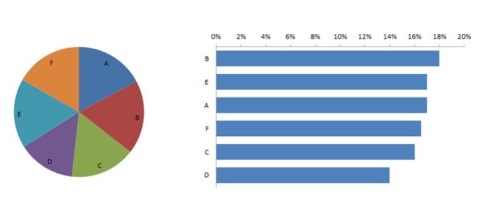
The book backs up the claim with a compelling example that I’ve attempted to recreate below — which of these two charts do you find it easier to interpret?

But recent research by Tufts University seems to make the answer less clear-cut.
Researchers monitored the brain activity of participants making a percentage estimation of a chart section compared to a previous chart, using both a bar chart and a pie chart. After examining all the data, their conclusion was that they rejected their “initial hypothesis that brain signals would indicate that bar graphs are easier to use for most people”
Some participants said they found the task easier using bar charts and others found pie charts easier. This appeared to be backed up by both the observed brain activity and the reaction times and error rates of the two groups. However, the type of chart used didn’t seem to make a difference in terms of analysis performance: “despite a clear separation in brain activity between the bar high demand group and the pie high demand group, we observe very little difference in response time and error.” In addition, “there was no indication that either bar graphs or pie charts were superior across all participants on this particular task.”
Here is a short video summary of the study:
This is clearly one small study that concerned a particular (and potentially unusual) task, and should be considered in light of other research. But more data is better, and I would encourage you to spend as much time understanding what’s interesting about the study as you spend trying to figure out why you can disagree with it… I also hope that it might encourage more nuanced, less dogmatic discussions of data visualization best practice.
Comments
7 responses to “Brain Scans Show No Difference in Pie Chart and Bar Chart Perception?”
With all respect to Stephen and Timo and Edward and the thousands of visualization experts and statisticians that know much more than me…. sometimes we are hung up on the wrong question.
As with most “which is better?” questions, the answer is:
It depends.
What is the story that you want to tell? What is the data saying that is most important for us to understand? Who is the audience?
Pie charts can do a good job of conveying proportion to a whole. And the larger population is more familiar with pie charts which can be useful.
Bar charts can do a better job conveying the difference between portions.
And of course it is easy to come up with exceptions to these generalizations.
In my experience, one-upmanship can take the participants off of the useful path and into the weeds.
Anyone who spend 1 minute looking at the suggested example above will come to the conclusion that bar graphs convey insight (biggest/smallest/relative comparison/ etc) far more effectively and efficiently than pie chart. No contest here.
To me, the only exception to this is when I need to express proportions in half, tiers or quarters (1/2;1/3 and 1/4). In that particular case I am indifferent to pie chart vs bar graph as I feels my brain can likely pick it up as accurately and fast either way. But that is just me…
Apart from visual esthetics, I am wondering why bar charts need to be so thick given the surface doesn’t convey any information itself. Would a simple (bold) line be sufficient in most cases?
Enrico,
You’ll find if you read this study that it was poorly designed. None of the findings that it claims are accurate. Those who reviewed this paper for CHI should not have accepted it. Unfortunately, this happens too often in the fields of information visualization and human-computer interaction research. This study did not test the effectiveness of bar graphs vs. pie charts. The tasks that it monitored did not simulate actual chart use. What test subjects were asked to compare existed on separate screens that were not simultaneously visible. In other words, what they measured was working memory, not the use of charts.
[…] are vastly superior to pie charts. That prevailing wisdom was called into question last week as a recent study from Tufts University gained attention from Timo Elliott on the Business Analytics webs…, possibly reigniting the long-running debate about pie […]
Hi, I did not read the article yet but I know the authors personally and they normally do very rigorous science and are very well respected scholars in the field. To answer to your initial question: yes the paper is peer-reviewed and the CHI conference is the top conference in the world on Human-Computer Interaction.
That said it is certainly possible it has limitations or shortcoming. I just wanted to add some little context here. Plus I think it’s a beautiful study which deserves respect for its innovation in the evaluation technique.
Timo,
The study has so many issues that I would not accept any of its conclusions without a great deal of further study. Is this article peer-reviewed?
At the high level, here are some of the headline problems with the logic and experiement setup:
* This study has too many moving parts (the scope is too great) . I believe the article was using bar vs pie as a way to see if a new method of brain scanning, fNIRS, is useful. fNIRS itself has not been proven effective as a tool to examine he visual cortex. Choosing a known and accepted visual problem would allow the researchers to determine first how well fNIRS works on the visual cortex.
* the visual problem is setup in a way to prejudice toward more effective pie charts (the line of interest is horizontal)
* the task on the pie chart is one that lends itself toward better results with a pie, but you can not generalize to all bar vs pie tasks from one task.
In short, the article is fun to read, but not one that will affect the practice using bar vs pie, nor overturn many rigorous articles that have actually been reviewed by others and accepted to have academic merit.
[…] « Brain Scans Show No Difference in Pie Chart and Bar Chart… | […]