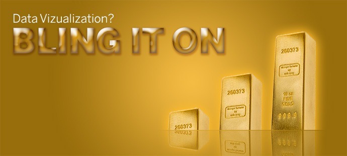

[I shouldn’t have to say this, but… warning, SATIRE ahead:] This timely post looks at how big data is leading to a big surge in flashy data visualization, as the staid world of business bar charts finally embraces its inner “bling.”
Visualization Best Practice: Apple Shows The Way
“Some people say skeuomorphic design elements like 3D shadows, imaginary glass highlights, and superfluous animation have no place in modern data visualizations” says Sue Donihm, a business intelligence dashboard designer in San Francisco. “But look at Apple: they know that good design includes some powerful bling — seriously, if Apple does it, you know it has to be cool, right?!”

Image: the Apple iPad interface, complete with the 3D shadows and fake highlights that have lead to the product’s success
Donihm explains that she tries to create interfaces that “grab the eye of my internal business customers and inspire the same level of fan loyalty” as the iconic brand.
The Consumerization of Corporate IT
IT teams around the world are being pressured by employees to keep up with consumer computing. Modern managers say they are no longer willing to put up with subtle colors and straightforward, actionable displays.
“Why can’t my business dashboards look like the same flashy interfaces as the video games I play all day on my iPhone?!” complained insurance actuary Al Verage.
“My work involves serious data analysis using hundreds of boring tables and charts — I’d love to be able to take a break from all that with some prettily-colored dashboards”

Image: Xcelsius, an early pioneer of dashboard bling
Verage praises the role of Xcelsius, a flash-based business intelligence product created by former video game designers, in pioneering data visualization bling: “they were way ahead of the curve — they practically invented business charts with reflections.”
He regrets that since the acquisition of the company, the zeal for bling has diminished: “in the new SAP Visual Intelligence product, the defaults are now neutral colors, sensible bar charts, axes starting at zero — you really have to work if you want to bling it up now”


SAP Visual Intelligence’s sober, blingless default interface, and the now-grayed-out 3D pie chart option.
BI Users Craving Next-Generation Interfaces
However, other visualization vendors are picking up the torch. Tableau, a data visualization product that famously didn’t offer pie charts in early versions has now seen the light.

The latest version of Tableau was recently launched under the banner “Crave More Bling?,” emphasizing the new flashy capabilities like tree maps and bubble charts.

Jim Hunt’s data stands out in this new eye-catching visualization experience using Tableau 8
Improving the Real-Time Customer Experience
Retail executive Magnus Caseus is particularly interested in attractive mobile dashboards: “I don’t really care what’s in the dashboard, but having a sexy-looking interface available on my mobile phone means I can show it to my customers while we’re playing golf, and it really helps build a relationship”.
Caseus is particularly interested in the new opportunities such as augmented reality business intelligence: “anything that gets me a new iPhone 5S works for me!”


Information as an Asset
Industry analyst Tasi Agoras believes that information is becoming a key part of the new ‘customer experience’, rather than just being a byproduct of company activity: “Companies want to impress consumers with flashy information interfaces during the sales cycle. It’s just like consumer packaging — they’re looking for something that catches the eye, that shouts ‘notice me!’ And the bar is getting ever-higher: it has to be real real-time now: it’s the minimum it takes to impress people these days”
Designers on the Bleeding Edge
Graphic designers are jumping into the new opportunities with both feet. “All those straight lines and pastel colors were seriously limiting my opportunities for artistic expression” says Dee Zyner, a professional ‘interface harmony balancer’.
“I especially like curved bar charts – they’re new and different… business people are tired of the same old views, they want some excitement in their lives, and the next generation data visualization tools let me provide it”.


Image credit: Data Viz, Improving data visualization for the public sector.
“Terry McCandle is my hero – sometimes I look at his colorful, exotic visualizations, and I have no idea what I’m looking at… I enjoy the mental puzzle of trying to find out exactly what it’s supposed to be about” explained Zyner.
In contrast, she feels that with “old-school designers like Tufty and Feud, it’s too easy to understand the data — there’s no intellectual challenge”

Looking to the Future
As memorably demonstrated in Hans Gosling’s TED talk, information bouncing around the screen can be a very exciting experience.
Zyner is particularly excited about the future of animated analytics: “I’ve noticed the explosion in interest in platforms like Tumblr and Vine — clearly, what’s needed in business data visualization is more animated gif files”.
The Education Policy and Data Center has even created a handy guide on how to create animated gifs from your Excel charts.

Image Credit: Excel Hero Blog

Image Credit: Creative Bits
Conclusion
Well, what are you waiting for? Get out there and introduce some eye candy into your dashboards to make them more effective!
[Author’s note: given the particular nature of this blog, please do not syndicate this to other sites]
Comments
4 responses to “Data Visualization? Bling It On!”
Hi Timo,
I am big fan of you.
TIP:create animated gifs from your Excel charts.
We can use this tiny open source tool.
http://www.cockos.com/licecap/
Thnak you
[…] don’t have to be complex or flashy. In this case simple visuals make a more effective display. Below is a particularly bad chart. […]
[…] examples exhibit appallingly bad visualization practice. If you have a problem with that, I say “Bling it On!” (note, I published that post on April Fool’s […]
[…] April Fool’s Day I did a post on Data Visualization Bling. It included a mention of curved bar charts (a ridiculous idea), but I didn’t find any really […]