Seth Grimes of Alta Plana gives us a great example of business intelligence failure this week on the site USAspending.gov.
I wrote about this site and others in a post in July, Great Examples of US Government BI Transparency. Unfortunately, it turns out that it’s not so great, in that some of the data shown was completely false… (this is generally considered a reasonable baseline of things to avoid).
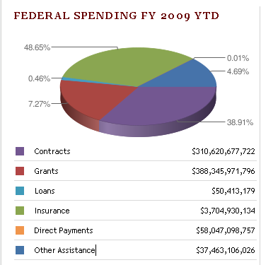
Seth gave the example of the graphic on the left below: “The Green and Purple segments are approximately equally sized even though the green segment should be 25% larger than the purple segment”. Thankfully the problem has now been corrected, and the site now shows what the chart should look like (with the data values now slightly updated) – see how much larger the “grants” area is now.


The problem turned out to be with the way the site calls the Google Chart API. The values passed to the engine for display were absolute values, not percentages, so they are being truncated. (I’m biased, of course, but to me, that sounds like a good reason to rely on a full BI solution, rather than the Google Chart API… )
The real big cause for concern is that it was apparently only when the webmasters read Seth’s blog posting that they realized they had a problem…

Comments
2 responses to “BI FAIL #2”
I can only say, what a poor visualization, to repeat myself:
Not only are slices/angles in a pie chart hard to distinguish for the human eye (humans can distinguish very well length and position, that is why 2-d bar charts, 2-d line charts, and xy charts work so well), but the 3-d look makes it even harder as it obscures slices, and the angles of the slices are distorted.
I can only stronlgy recommend to go with a 2-d plain horizontal bar chart, where the bars are sorted in descending order according to the measure (see http://www.perceptualedge.com/example12.php)
Stephen Few has an excellent website for “information visualization”: http://www.perceptualedge.com
Timo, thanks for picking up on my blog article. There are significant BI failures on the GSAspending.gov that are less visible than the graphics problem caused by the misuse of the Google Chart API but as important if not more.
The biggest is incomplete and missing information. It is clear that records that are supposed to be and that are claimed to be there are not, for instance, about the U.S. government’s fiscal year 2009 contract spending on USAspending.gov itself. That’s an example of missing information where there’s no hint that it’s missing. Incomplete information: the site doesn’t include subcontract records. My *guesstimate* is that double-digit-percentage U.S. federal government contracting revenue goes to subcontractors. Without this information, the site is incomplete and gives a very misleading picture where federal money goes.
Seth